


Setting Up Product Properties
After you create a Product Profile with a name, currency and setup language, you can start setting up the relevant product properties for the product profile.
In the Product Properties page, you define the set of properties that will be associated with the product when a customer views the product on the Storefront and when the product is viewed in the Back Office. When you set up product properties, you also define how the properties will be available for customer selection. For example, you can define the type of stock, lamination, folding and printing color that will be available for a specific product. In addition, you also define if these options will be displayed to customers as a drop-down list or a set of check boxes.
Product properties may affect various aspects of product pricing, delivery and production. For example, a Paper Type property may affect price, whereas a Paper Weight property may affect delivery. You can add product properties that may affect product price.
 Setting up product properties for Product Profiles is similar to
setting up product properties for a single product.
Setting up product properties for Product Profiles is similar to
setting up product properties for a single product.
To view the properties of a Product Profile:
1. In the Stores view, select Product Profiles.
2. In the Product Profile List page, select the required Product Profile.
3. In the Settings page, click Product Properties Setup.
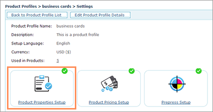
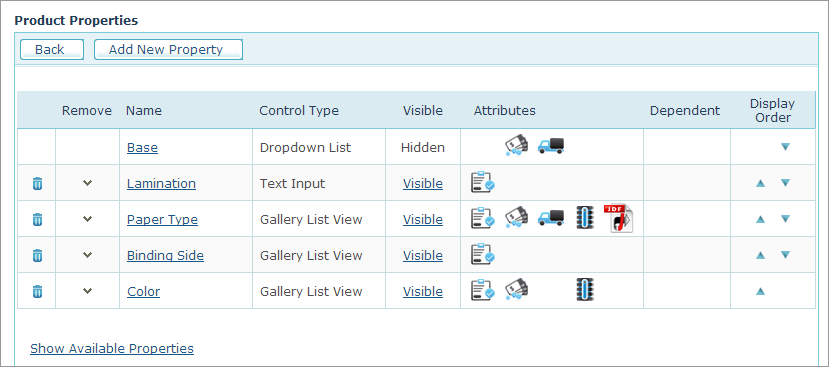
The Product Properties list includes the product properties that were defined for the Product Profile. These properties are available to all the products linked to this profile.
4. To display
all the available properties, click the Show
Available Properties link.
The Available Properties list
displays all the unassigned properties, including properties that were
defined as Global product properties.
For more information on how to define Global product properties,
refer to Setting
Up Global Product Properties.
The following table describes the information provided on the Product Properties page and lists the actions that you can perform for each property.
|
Add New Property |
Click to set up a new property and add it to the list of properties. For more details on how to set up a new product property, see the procedure below.. |
|
Delete property |
Deletes a product property. |
|
Remove/Add buttons |
The pointing-down arrow removes a product property from the list of selected properties. The property moves to the list to the Available Properties.. You can use the pointing-up arrow to add a property from the Available Properties list to the Product Properties list. |
|
Name link |
Opens the Product Properties page in which you can configure all the property parameters, such as Input Control and Validation settings. |
|
Control Type |
Indicates how the property will be available for customer selection. For more details on how to set up control types, see Setting Up Customer Input Controls. |
|
Visible link |
Enables you to override the Product Profile visibility settings, as well as change the default value of a property option. For more information, see Overriding Product Profile Settings. |
|
Attributes |
Indicates if the property can be edited and if it affects pricing, delivery or aggregation parameters. It also indicates if the property is supported by the JDF file created during product production. |
|
Dependent |
Indicates if the property includes sub-properties. For example, the binding property may include several types of binding under it. |
|
Display Order |
Enables you to define the order in which the properties are displayed on the Storefront. |
|
Show Available Properties link |
Click the link to display the list of all the available Product Properties. |
|
Global |
This icon appears in the Available Properties table and indicates that the property is a global property. |


To add a new product property:
1. Click
the Add New Property
button.
The Product Properties page
is displayed. View
image

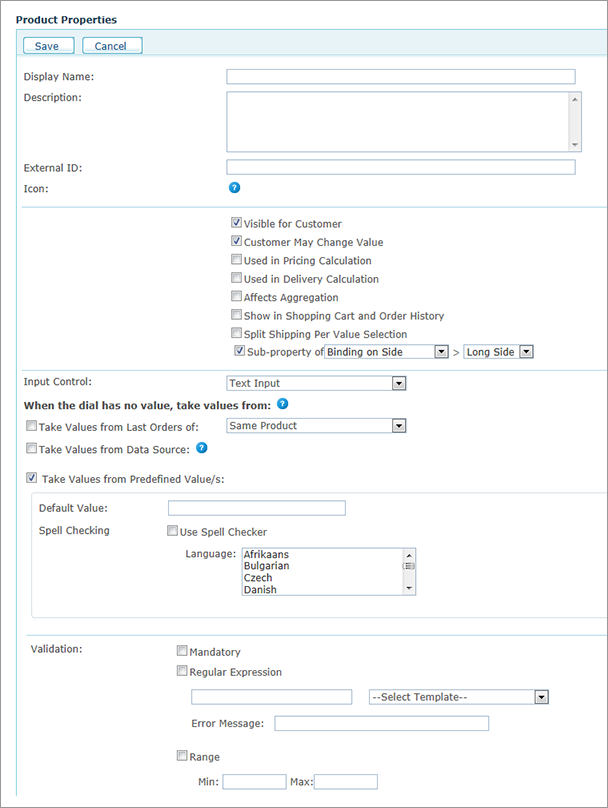
2. Fill in the Display Name and Description fields for the newly created product property.
If desired, you can design and display an icon to appear in the
Storefront next to the property name.
This icon should be placed in the folder: \uStore\App\CustomerApp\Images\[SkinName]\PropertyIcons
It should be in PNG format and should be 20 x 20 pixels in size.
The name of the image for the selected status should be PropertyName_selected.PNG and
for the unselected status, PropertyName.PNG.
In the current version, this option is only available for Composite
Products.
5. Select the relevant checkboxes for the product property:
● Visible to Customer. You can override visibility settings as well as default property options when you set up a product. For more information, see Overriding Product Profile Settings.
● Customer May Change Values: The property is editable by customers.
● Used in Pricing Calculation: The property Is used in pricing calculation.
● Used in Delivery Calculation: The property Is used in delivery calculation.
You can define a product property that affects delivery cost calculations. For example, you can define several types of paper (for example, matte, glossy and plain) where each paper type has a different weight and thus affects the delivery cost.
Delivery prices are determined during product setup, as described in Setting Up Delivery Overview.
● Affects Aggregation: The property affects aggregation. For more information on aggregating orders, refer to Handling Orders.
● Show in Shopping Cart and Order History: The property is displayed in the Shopping Cart and Order History pages.
● Split Shipping per Value Selection: The property can trigger split shipping. When in the Finalize step of the ordering process a customer selects a Product Property value, the system verifies that this value is identical to the values selected for this Product Property in other products of the same order. If the values are not identical, the system automatically triggers split shipping.
For example, if a customer ordered two products, both of which have a Turnaround Time Product Property, and the value of this property is different for each product (5 days for Product 1 and 10 days for Product 2), then each one of these products will be shipped separately. In the Storefront, when the Shopping Cart has items with properties that are set to Split shipping per value selection, if these properties have the same name but are assigned different values, the system will show a warning. The warning will also be displayed if the Shopping Cart contains one item with a property that is set to Split shipping per value Selection, and another item that does not contain this property.
● Sub-property of: The property is a sub-property of another property.
You can create a dependency between product properties. A property can be a sub-property of any property that includes property options such as Drop Down List, Radio Button List, Checkbox, Gallery List and Gallery Grid View. A property option can have multiple sub-properties and a sub-property can be dependent on one property option only. Select the property on which the new property will be dependent from the drop-down list, and then select a property option from the list of options available for that property. The property will be shown as being Dependent on the selected property in the Product Properties page.
When ordering in the store, the sub-properties are only displayed once you select the property option on which they are dependent. For example, if you defined a property for Spiral Colors that was dependent on the Binding Type being Spiral, the Spiral Color options would only be displayed, if you selected Spiral from the Binding Type options.
6. Select the type of Input Control required from the customer, as explained in Setting Up Customer Input Controls.
7. Select the Validation Option. The available validation options vary according to the selected Input Control, as explained in Validation Options.
8. Click Save Changes to
save the product property.
The product property appears in the Product
Properties page.